Poshmark · Listing Details
Poshmark's listing details page was the most visited page on the platform and the most cluttered. This is how a phased redesign turned it into a focused, conversion-driven experience.
The listing details page is where every purchase decision on Poshmark happens. A buyer arrives, sees the item, reads the details, and decides to buy, offer, or leave. At 17 million daily views, even marginal improvements in how that decision gets made compound into significant business outcomes.
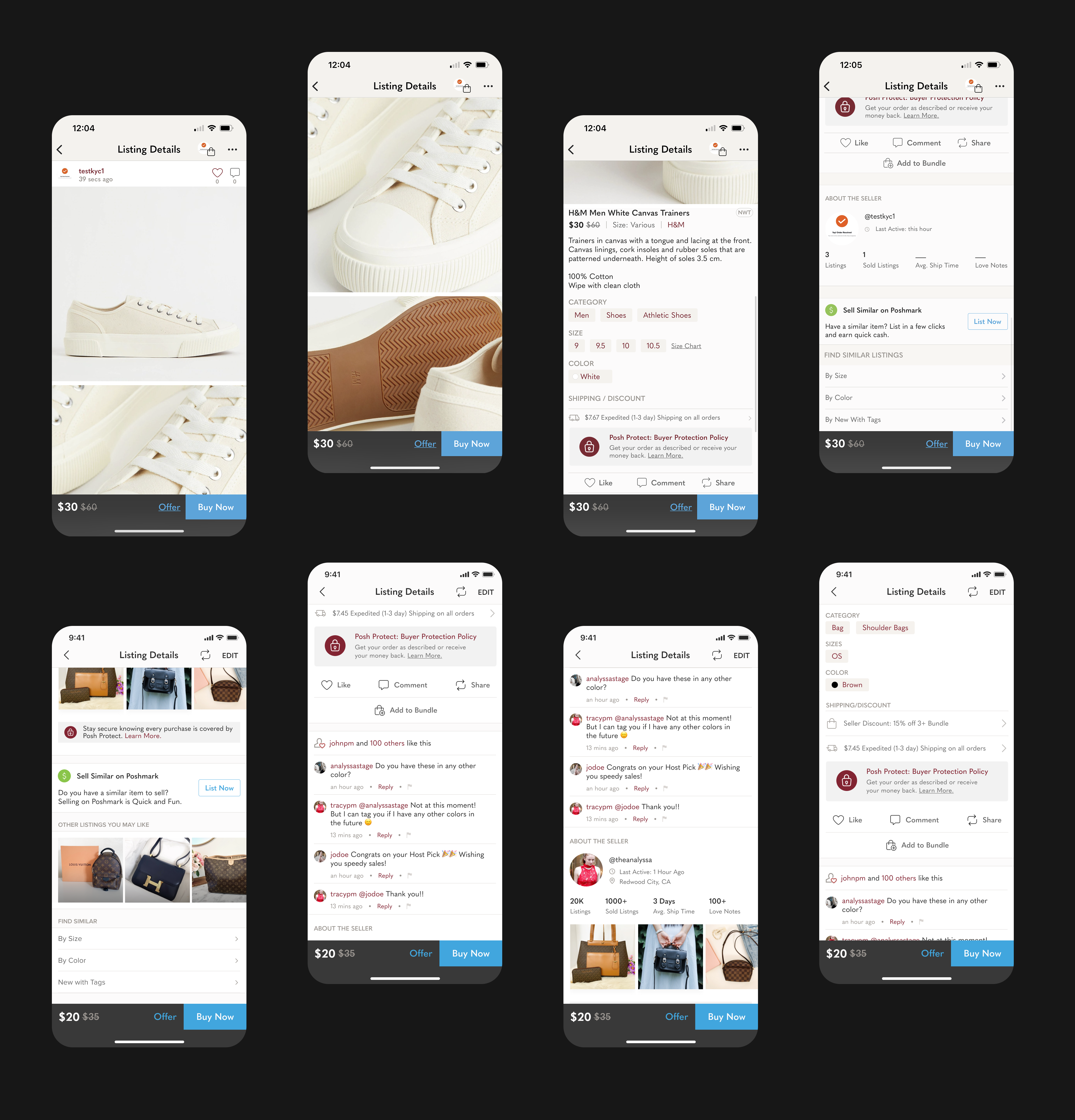
The problem was that the page had been built incrementally. Each team added sections over time without a unified information architecture. The result was a page that mixed trust signals with noise, buried the purchase actions behind exploratory links, and presented information without visual priority. It wasn't a bad page. It was a page that had never been designed as a whole.
Before · The original listing details page — built incrementally by multiple teams, no unified information architecture, purchase actions buried below exploratory links.
By restructuring the information architecture to reduce low-intent exits and surface purchase-critical details more clearly, we can increase conversion without cannibalising revenue or engagement. Every link we removed was a decision to trust the page hierarchy over the safety net of exploration.
Rather than a single big-bang redesign, I structured the work as three pre-redesign A/B tests followed by a full redesign — each independently shippable, each building evidence the next phase depended on. Every phase had its own hypothesis, its own test, and its own graduation decision before the next began.
Buyers of secondhand goods rely heavily on photos to build trust. The original vertical layout required significant scrolling to see all images. We replaced it with a horizontal swipe gallery, giving buyers faster access to the full set of photos without losing context of the rest of the page. 4 weeks to ship.
Phase 1The core intervention. Removed all hyperlinks from product metadata, reordered the information hierarchy to surface title, brand, and price first, elevated deals and promotions to a dedicated row, standardised size display, and collapsed long descriptions. This was the highest-risk phase. 6 weeks to graduate.
Phase 2With the product details restructured, we tested whether Buy Now and Offer buttons should appear above or below the product details section. Two variants, A/B tested across logged-in users and visitors. The below-fold variant showed stronger directional performance. The result informed the default CTA position for the web rollout. 5 weeks to ship.
→ SynthesisThree phases of validated evidence locked in as a design spec. The redesign brief was built on data, not assumption.
Secondhand buyers rely on photos more than almost any other signal - condition, authenticity, and fit are all visual judgments. The original vertical scroll worked but required significant effort. Before committing to horizontal, we ran a simultaneous A/B/C/D test across three challenger variants to find out which gallery pattern gave buyers the fastest path to confidence.
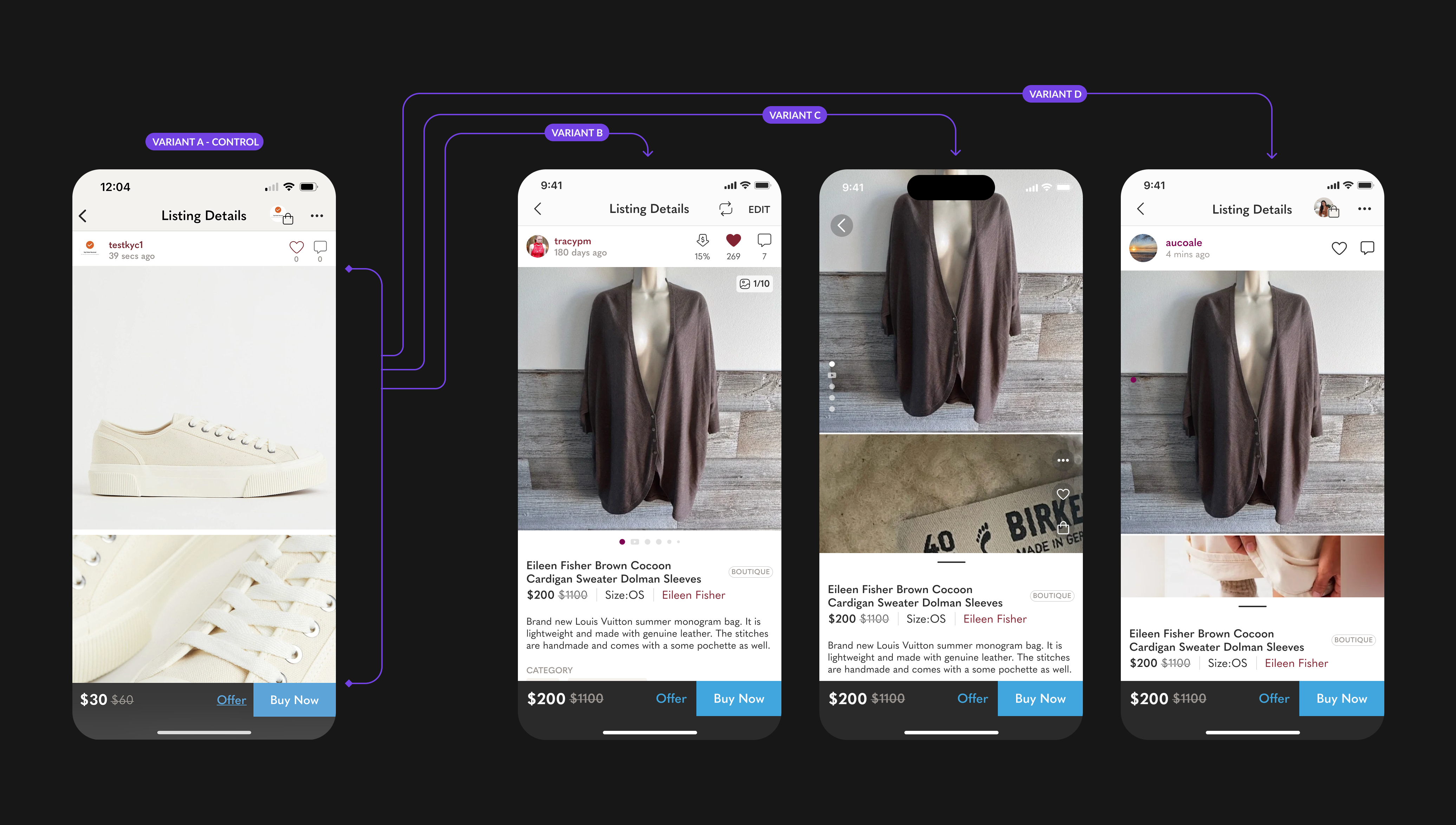
All four variants side by side - Vertical Scroll (A/Control), Horizontal Swipe (B/Winner), Split View Scroll (C), Split View with Top Nav (D). Tested simultaneously across equal traffic splits.
The horizontal swipe gallery gave buyers the fastest path to confidence without sacrificing access to the full photo set. Variant A's vertical scroll buried product details below multiple full-height images. Variant C's split view reduced image size to keep content visible, which hurt the trust-building quality of the photos. Variant D's tap gate added friction before buyers could even start comparing photos. Variant B let buyers move through images at their own pace while keeping product details immediately in reach below the fold.
With the image scroll resolved, Phase 1 turned to the harder question: what order should the information on the page follow? The risk was defaulting to a hierarchy that made sense to the business - prominence by revenue contribution - rather than one that matched how buyers actually make decisions.
Before getting my head down in Figma, I ran brainstorming sessions and gathered research on what the page should prioritise. Most of the outputs were leaning heavily toward the business angle - surface deals, promote high-margin categories, push cross-sell. Legitimate signals, but not the full picture.
I went and spoke directly to buyers and sellers. The gap between what the business wanted to surface and what users were actually looking for to make a decision was significant. Users needed condition clarity, size confidence, and price context first - not promotions.
I ran a card sorting exercise with both buyers and sellers to let the hierarchy emerge from behaviour rather than assumption. Participants were given cards representing every piece of information on the listing page and asked to arrange them in the order they would want to see it. The results consistently placed photos, title, size, condition, and price at the top - the trust signals - and pushed cross-sell links, seller stats, and promotional badges further down. The data gave us the confidence to reorder the page in a way that served user intent first, with business signals placed where they would be seen by buyers who had already decided to consider the item.
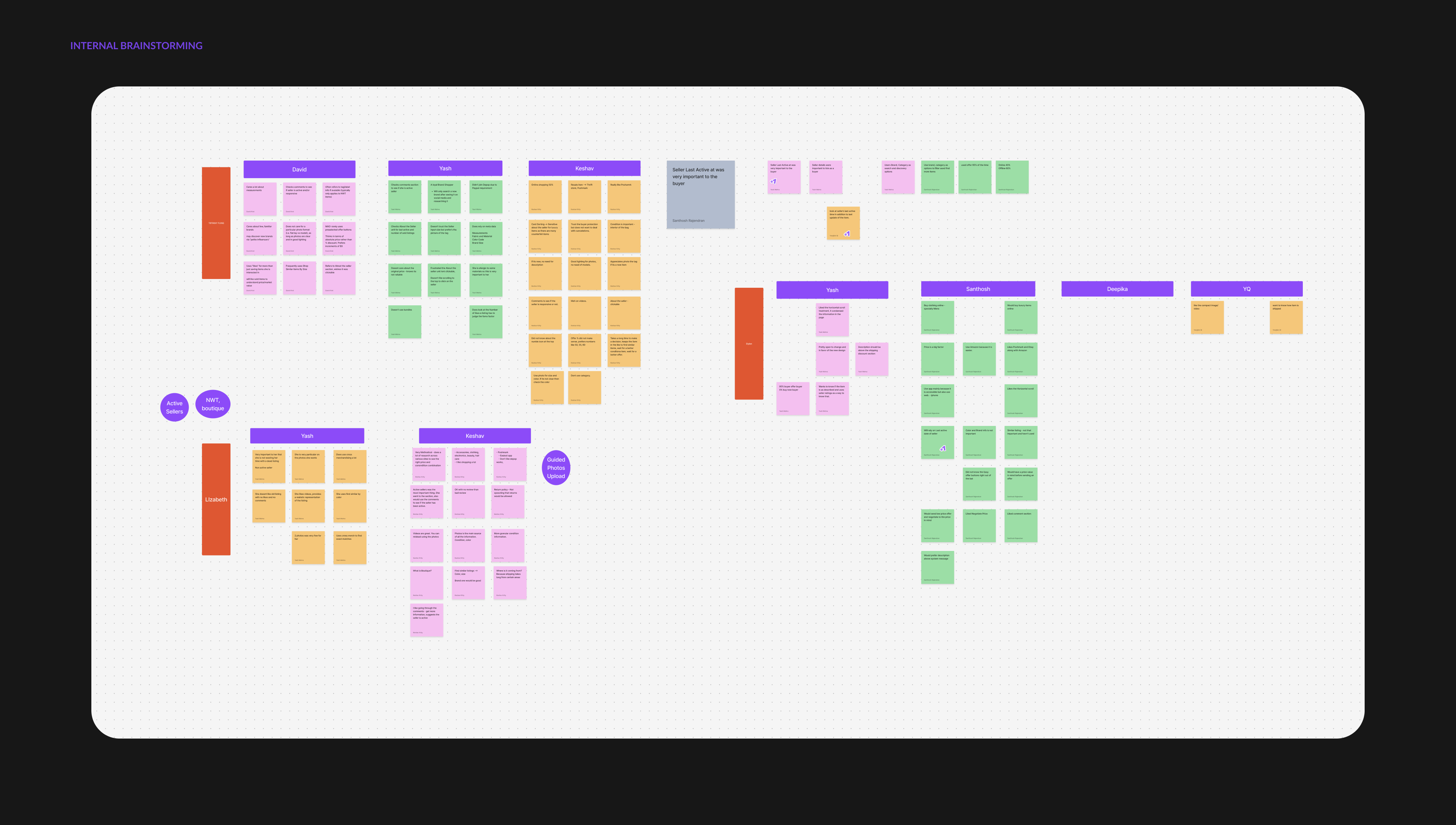
Internal brainstorming board - early hierarchy proposals from business, design, and product. Most outputs skewed toward business priorities before user research reframed the direction.
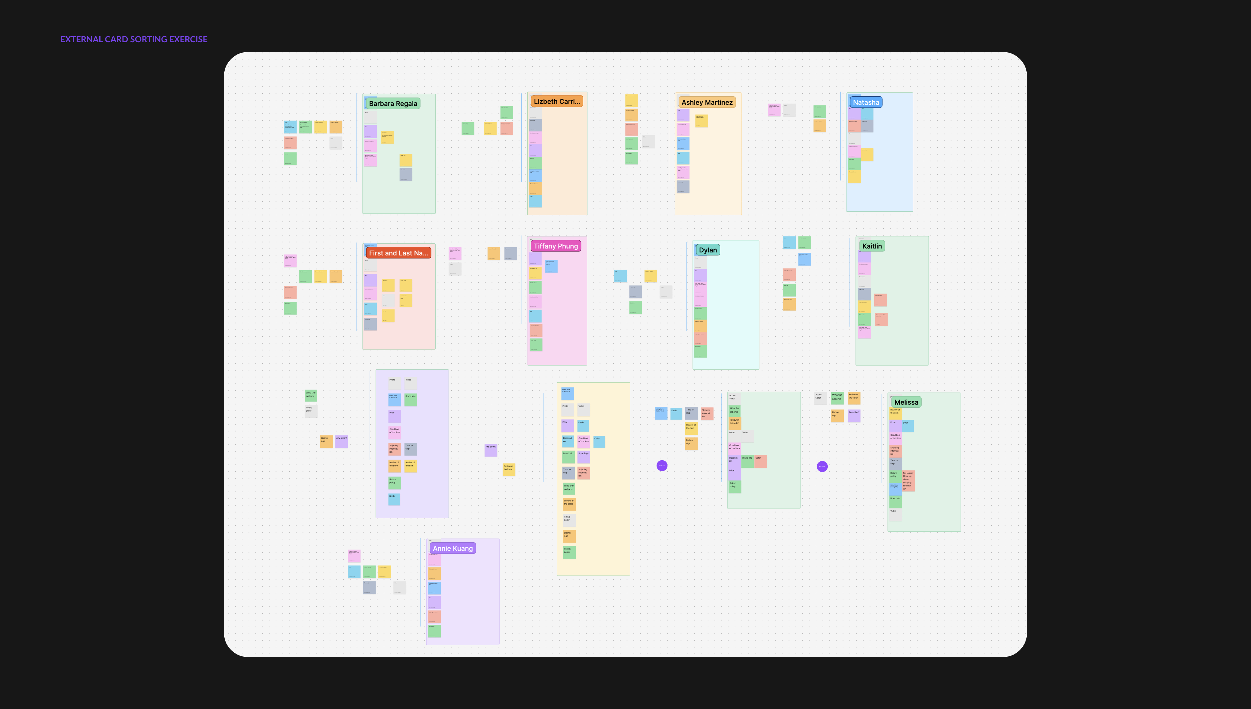
External card sorting exercise - buyers and sellers arranged every element of the listing page in the order they would want to see it. Photos, title, size, condition, and price consistently ranked first.
The card sorting exercise gave me a clear, user-validated information order. Getting the business to agree to test it was a different fight entirely.
Business owners were deeply skeptical. Their concern was that changing the order of information on the most critical commerce page in the product would cannibalize metrics - and if it did, it would not just kill Phase 1 but potentially stop the entire redesign project in its tracks. The resistance wasn't unreasonable. It was a high-stakes page and the proposed change was significant.
I negotiated. Instead of running the test across the full 36 user segments, I agreed to reduce the exposure to 14 segments. A smaller blast radius if it went wrong, enough signal to learn if it went right. We ran the test anyway.
This was still a pre-redesign test. The goal wasn't to ship a new page - it was to validate that the right information order existed before I committed the team to building on top of it.
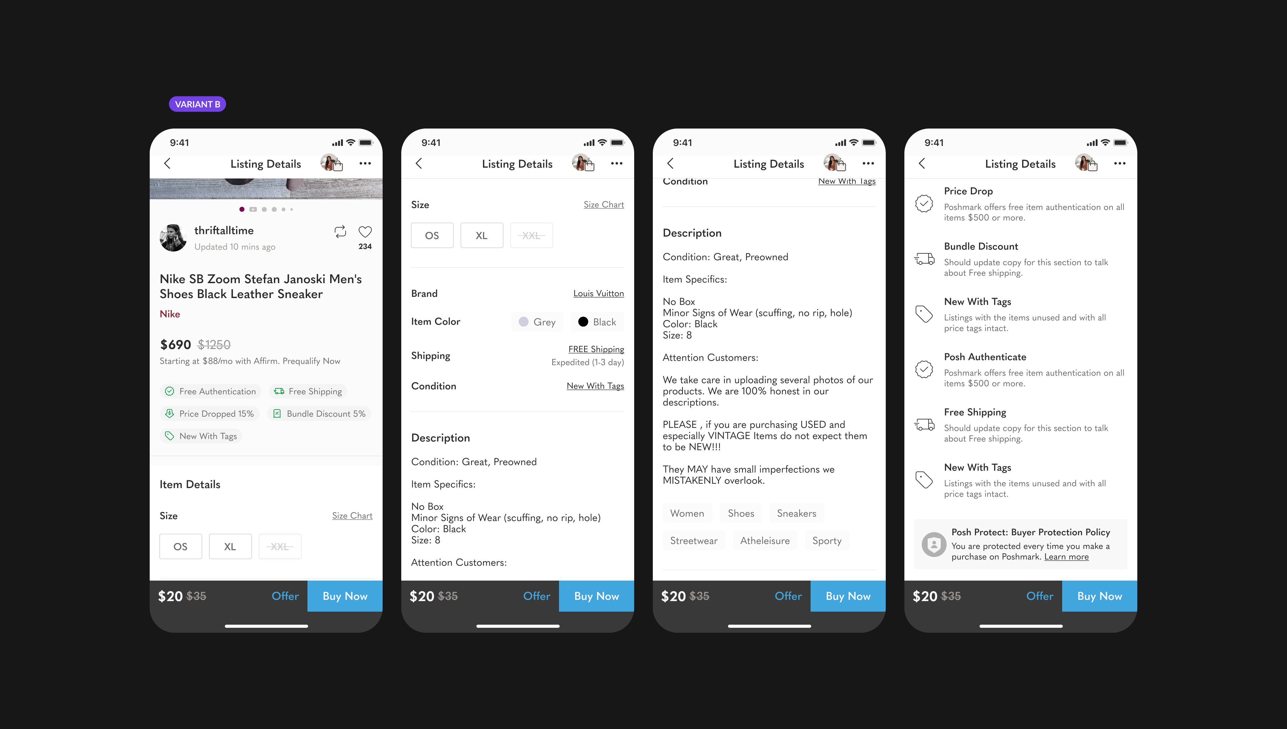
The validated 14-segment hierarchy - the order that carried into the Phase 1 test and later became the structural backbone of the full redesign.
The reordered information hierarchy tested cleanly across 14 segments. Surfacing photos, title, size, condition, and price as the top-of-page trust layer - ahead of cross-sell, promotional badges, and seller metadata - produced a measurable lift in conversion without cannibalising any of the metrics the business owners had flagged as at risk. The test gave us the data to graduate Phase 1 and carry the validated hierarchy into the full redesign.
Phasing the work wasn't just a risk strategy. Phase 0's clean graduation gave us the credibility to have Phase 1's harder conversation. The structure de-risked the design — and the politics.
From the Reflection section below
With the image scroll and information hierarchy validated, Phase 2 turned to purchase actions. The question was deceptively simple: should Buy Now and Offer appear before the product details, or after? The answer had real stakes - too early and you interrupt a buyer still forming intent, too late and a ready buyer has to hunt for the action.
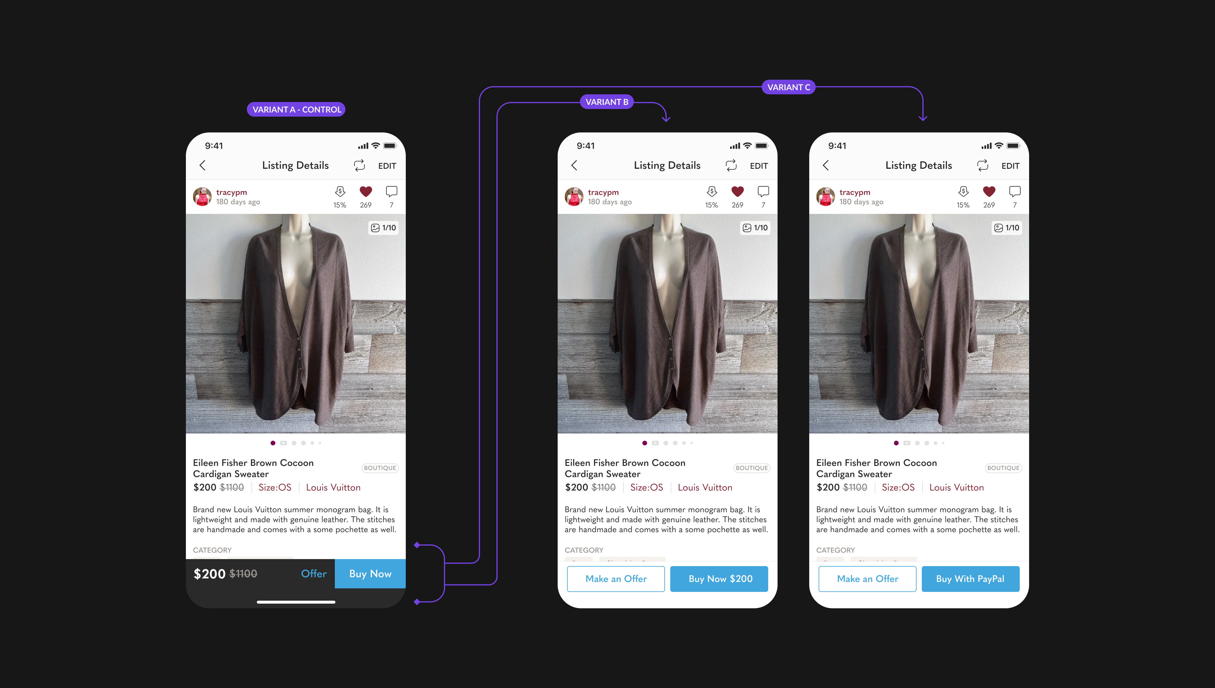
Phase 2 · Three CTA variants — Control (A) with static buttons above details, Sticky Separate CTAs (B) for new users, and Sticky with Pay With PayPal primary (C) for repeat PayPal buyers.
Both B and C outperformed the control, but for different reasons. New users benefited most from persistent, clearly separated CTAs - they were still orienting on the page and needed the purchase action to stay visible. Repeat buyers, particularly those whose last payment was through PayPal, converted faster when their preferred checkout method was already surfaced. The data made the case for personalising the CTA layer: one pattern for discovery, another for intent already formed.
The pre-redesign tests weren't a detour - they were the foundation. Each phase answered a specific question that the redesign needed to get right before touching visual design or engineering. By the time the redesign brief was finalised, we weren't guessing at hierarchy, scroll patterns, or CTA placement. We had data.
The full-width carousel with page indicator became the default image experience in the redesign. The vertical scroll control was retired. Swipe became the baseline assumption for how buyers interact with listing images.
The validated information order - negotiated down from 36 segments - was locked in as the structural backbone of the redesigned page. Every section from title to seller details followed the sequence buyers had ranked in card sorting.
The redesign shipped with a sticky CTA bar by default. For returning buyers with a saved PayPal account, Pay With PayPal was surfaced as the primary action - a personalisation layer informed directly by the Variant C result.
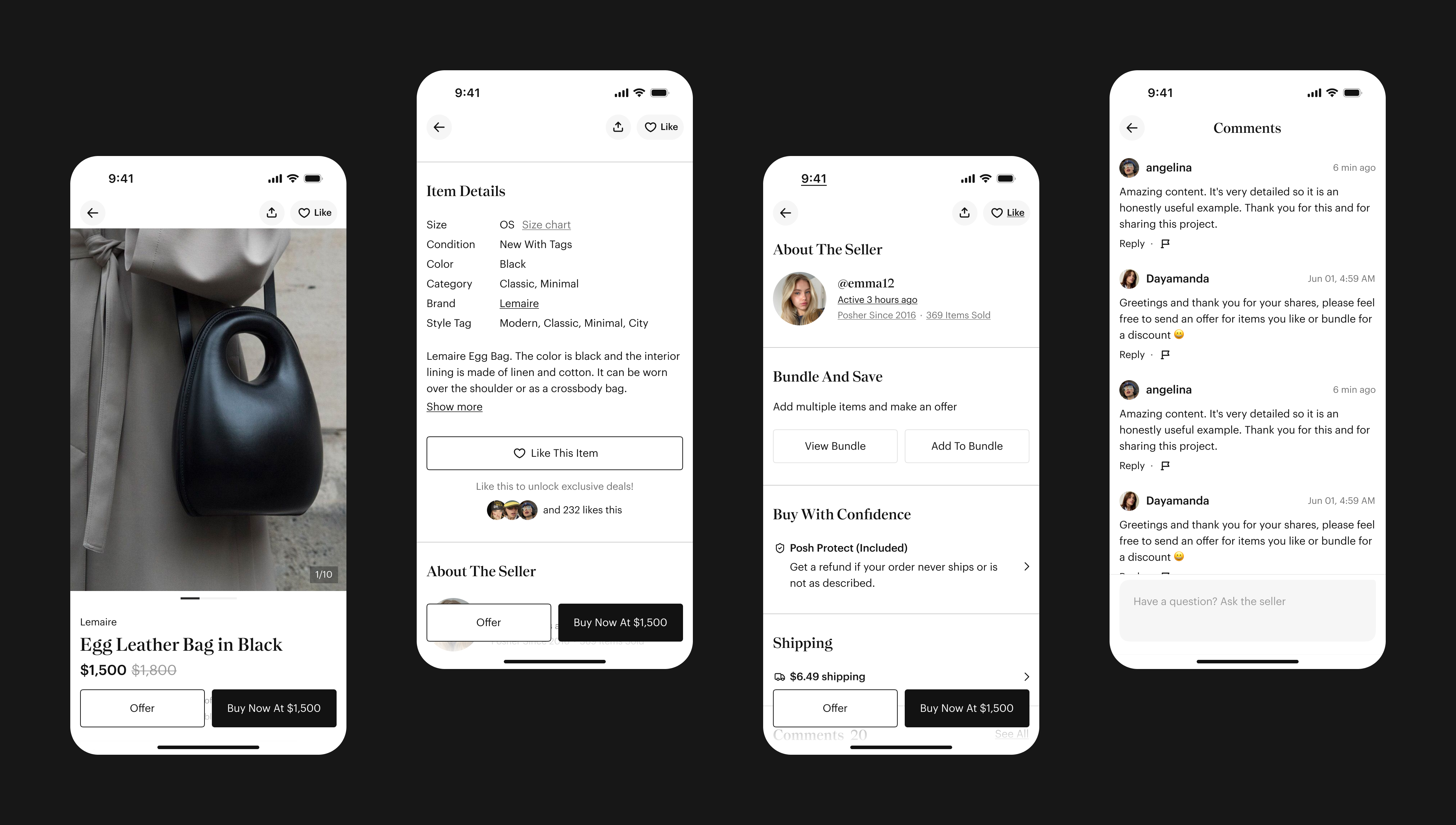
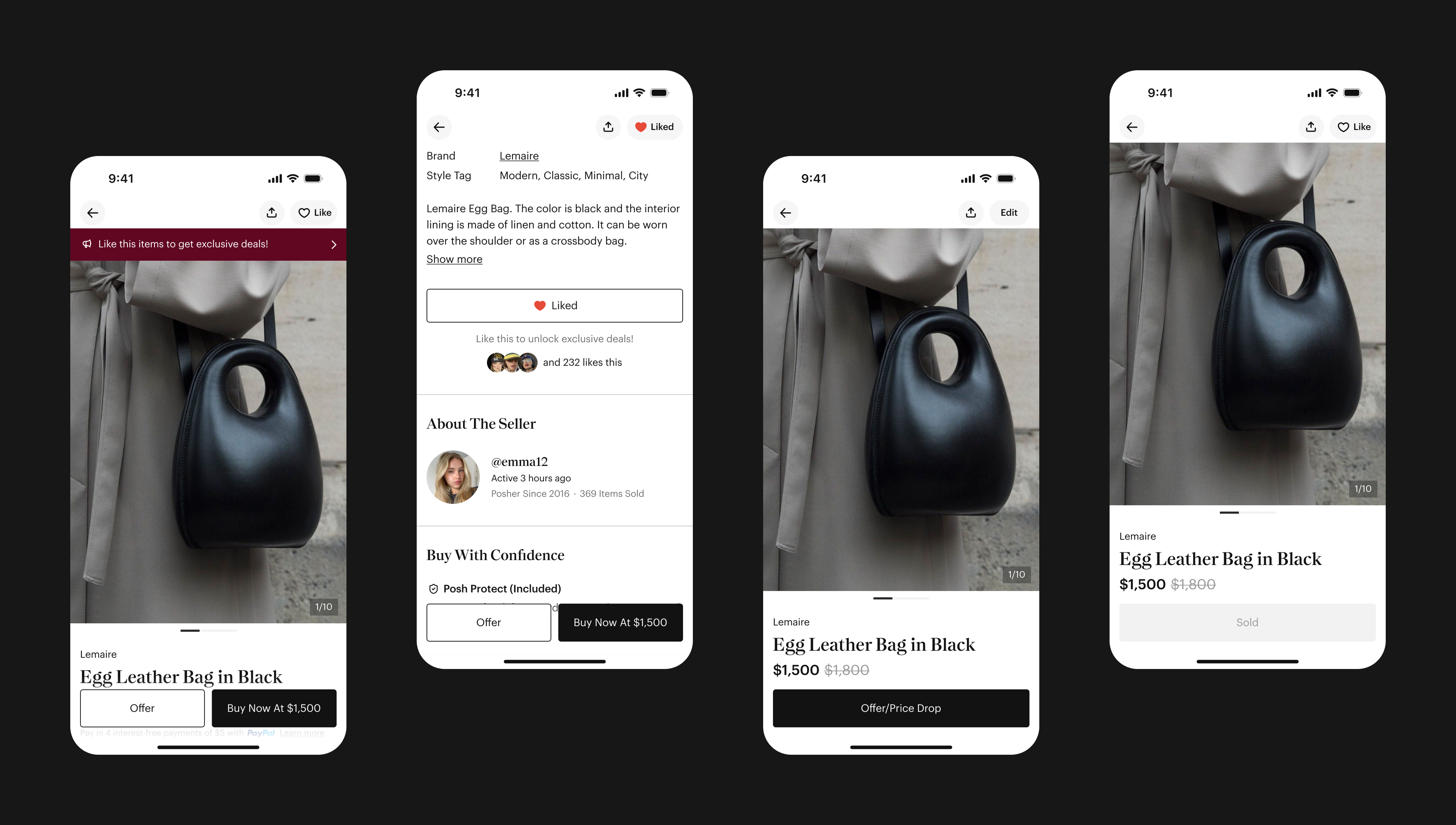
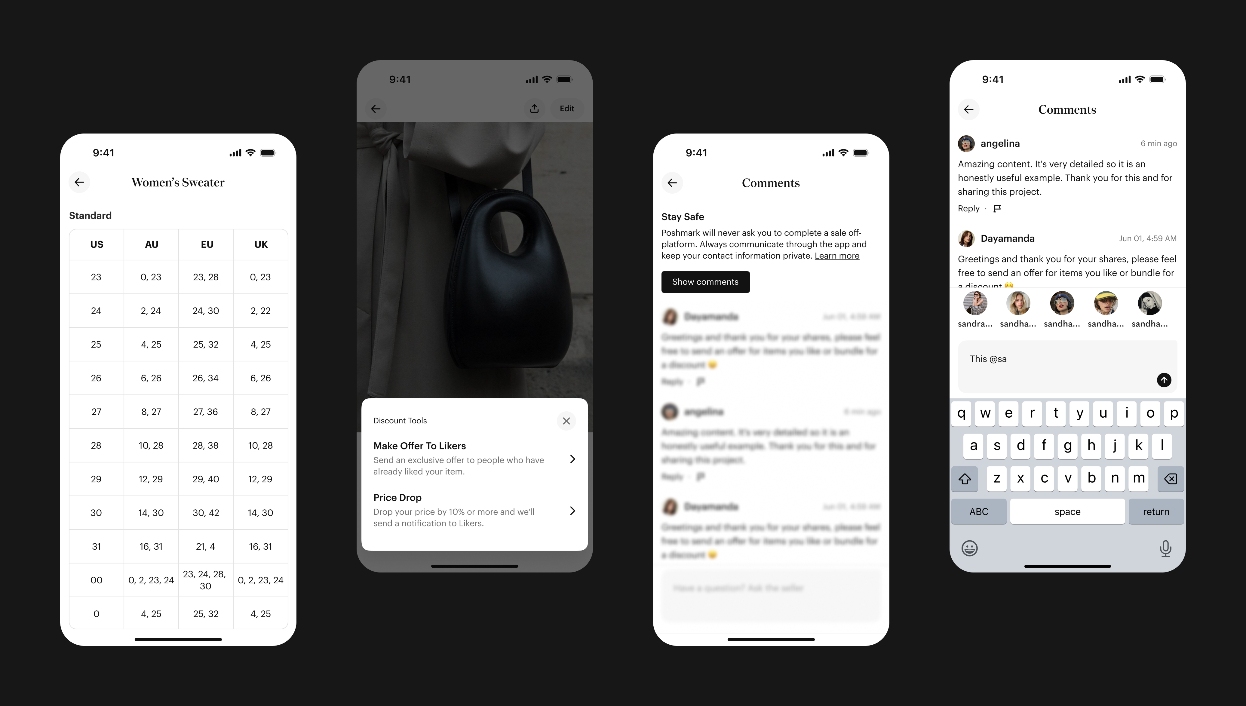
The shipped experience, end to end.
Pre-redesign testing meant the engineering build started from a validated spec, not a hypothesis. The hierarchy was agreed on. The image scroll was proven. The CTA behaviour was personalised by segment. The redesign itself became the vehicle for shipping what the data had already confirmed - not a place to run experiments from scratch.
Running three phases before the redesign added time upfront. But it compressed risk at the back end - fewer post-launch reversals, less stakeholder pushback on decisions already backed by data, and a cleaner engineering brief because the design intent was specific. The slow start made the ship faster.
These are the decisions that defined the redesign. Each had real disagreement, real tradeoffs, and data behind it - the moments where information architecture either improves conversion or creates new problems.
Category, subcategory, style tag, and department links had historically been clickable, sending buyers to browse pages. None of these pages had meaningful conversion rates. They served as exploratory exits from the highest-intent moment in the buyer journey. The debate was whether removing them would hurt discovery. The data said otherwise: Category and style tag pages had very low conversion rates, serving more as passive browsing paths than purchase paths. We removed clickability entirely and kept the metadata as non-interactive labels. The information stayed; the exit disappeared.
The original page placed the seller profile bar at the top, immediately below the nav. This was a holdover from when seller trust was the primary purchase signal on a younger platform. Qual research and user interviews surfaced a clear behavioral shift: by this stage of the platform's maturity, buyers evaluated the item first and validated the seller second. Poshmark's seller ratings, social graph, and buyer protection had matured enough that the item itself had become the primary trust anchor. Moving the profile below photos, alongside social actions, let the item speak first. Title, brand, and price followed directly below, creating a clean top-to-bottom purchase evaluation flow. The seller profile became a trust reinforcement signal, not a navigation anchor.
New with Tags, Boutique, Free Authentication, discounted shipping, and price drops had been presented as text metadata, easy to scan past. We redesigned them as a dedicated deals row with tappable buttons that pull up informational action sheets. Each button became a conversation starter, not just a label. The intent was to make trust signals feel earned rather than listed. A "Free Authentication" badge you can tap and read builds more confidence than the same two words in a text field.
Long seller descriptions were one of the main causes of page length variance. Some listings had two-line descriptions; others had ten. This made the page feel inconsistent and pushed purchase CTAs further down for long-description listings. We introduced a 500-character threshold with a "Show more" link. The default state is clean. Buyers who want the full description can access it with one tap. Sellers' content is fully available; it just doesn't dominate the page for buyers who don't need it.
The redesign ran as an A/B test across 26% of app users on iOS and Android. After a two-week test window, the results were clear enough to recommend graduation. Overall business metrics were neutral to positive. Purchase intent metrics moved significantly. The recommendation was to ship.
| Metric | Lift |
|---|---|
| Buy Now Clicks | +1.68% |
| Buyer Offer Clicks | +2.09% |
| D7 Order / First Match Conversion | +1.14% |
| App Buyer Orders | +0.33% |
| App Buy Now Orders | +0.53% |
| Metric | Lift |
|---|---|
| App Buyer GMV | +0.11% (neutral) |
| App Buyers | +0.07% |
| Cross-Merch Grid Views | +4.01% |
| Cross-Merch Grid Clickers | +1.73% |
| Ads Impressions on Listing Details | +2.82% |
First Match dropped -0.99%, driven by the No Purchase segment (-2.67%, representing 37% of all users). This triggered the hardest stakeholder conversation of the project. Mid-test, I was asked whether we should stop early. I held the graduation recommendation because the demand-match segmentation told a different story: the FM drop was a behaviour shift, not a revenue loss. Users were spending less time exploring the seller's closet from the listing page not because they were less engaged, but because they were making purchase decisions directly from the listing. D7 Order/FM conversion for the No Purchase segment improved +3.05%, and buyer orders in that segment increased +2.46%. I brought that segmentation into the stakeholder review rather than defending the aggregate number. The graduation recommendation was not unanimous, but it was grounded in the data. Two weeks after graduation, the metrics held.
The First Match drop created stakeholder anxiety mid-test that was difficult to manage in real time. If I had modelled the expected FM redistribution before launch, using demand match data we already had, we could have reframed the metric as a leading indicator of conversion shift rather than a loss. The story would have been the same. The conversation would have been easier.
The 500-character collapse was bundled into Phase 1 rather than isolated in its own test. We shipped it with confidence that it was the right call, but we don't know its isolated impact on conversion or engagement for long-description listings. That's a decision that deserved its own data, and on the next initiative, it would get one.
Four independent tests across 12 months meant four separate roadmap conversations, four alignment cycles, and four graduation decisions. The overhead was real. But it also meant every stakeholder had a clear entry point to question or support each change individually, without the weight of the whole redesign riding on one call. Phase 0's clean graduation gave us credibility for Phase 1's harder conversation. The phased structure didn't just de-risk the design - it de-risked the politics.
Cross-Merch Grid Views went up +4.01% despite removing explicit cross-merch navigation links from the product details section. The redesigned page created a more structured scroll path that surfaced the cross-merch grid to more buyers. This was a counterintuitive result that reinforced the core hypothesis: a focused page does more than a page that tries to do everything.
One of the outcomes I'm most proud of from this project isn't in the metrics. The designer who owned the web rollout had previously focused exclusively on mobile. I pushed for her to lead Phase 3 because she had built enough context on the product logic through Phases 1 and 2 that the surface shift was the right kind of stretch. She navigated the cross-Merch V3 compatibility work, pushed back on an engineering scope cut that would have compromised the hierarchy, and shipped. That's the kind of ownership I want to build in every designer on my team - not just executing a spec, but holding the design intent under real constraints.