Škoda
Connected
App
A conceptual redesign of a connected car app for Škoda vehicle owners, bringing keyless access, remote controls, and real-time vehicle insights into a seamless mobile experience.

A conceptual redesign of a connected car app for Škoda vehicle owners, bringing keyless access, remote controls, and real-time vehicle insights into a seamless mobile experience.
Connected car apps are notoriously clunky. They're built as feature dumps, not experiences, burying the most-used actions (unlock, climate, fuel check) behind deep navigation hierarchies while offering little contextual awareness.
This concept explores what a Škoda Connected app could feel like if it prioritised the user's daily rituals over feature completeness. From a friction-free OTP onboarding to a Dashboard that surfaces the right information at the right moment, every screen was designed from a place of intent.
Škoda occupies a compelling space in the automotive market, a brand that prides itself on being "Simply Clever." Yet its digital touchpoints have not kept pace with this positioning. This concept is a love letter to what their app could be if it lived up to the brand's promise.
Here's what the process actually looked like, the assumptions that proved wrong, the pivots that felt risky, and the tensions I had to hold.
My first iteration had 8 action tiles on the home dashboard, every feature a Škoda owner could need. It looked impressive in Figma. In walkthrough, every reviewer immediately asked "but what do I tap first?" I'd optimised for completeness, not clarity. I cut it to 4 primary actions.
The original scope included a live vehicle location map as a top-level tab. Engineering flagged that GPS polling in background would drain battery by ~18% per hour, a dealbreaker for trust. Instead of fighting the constraint, I reframed: location becomes a contextual detail (parking floor, last seen) rather than a live feed. Smaller scope, but more honest.
Engine start requires 2 taps by design. Early feedback from 3 informal testers said "just make it one tap." But a one-tap engine start on a car is a safety risk, accidental activation, pocket starts. I held the friction. The right UX and the comfortable UX aren't always the same thing. I documented this explicitly in the design rationale.
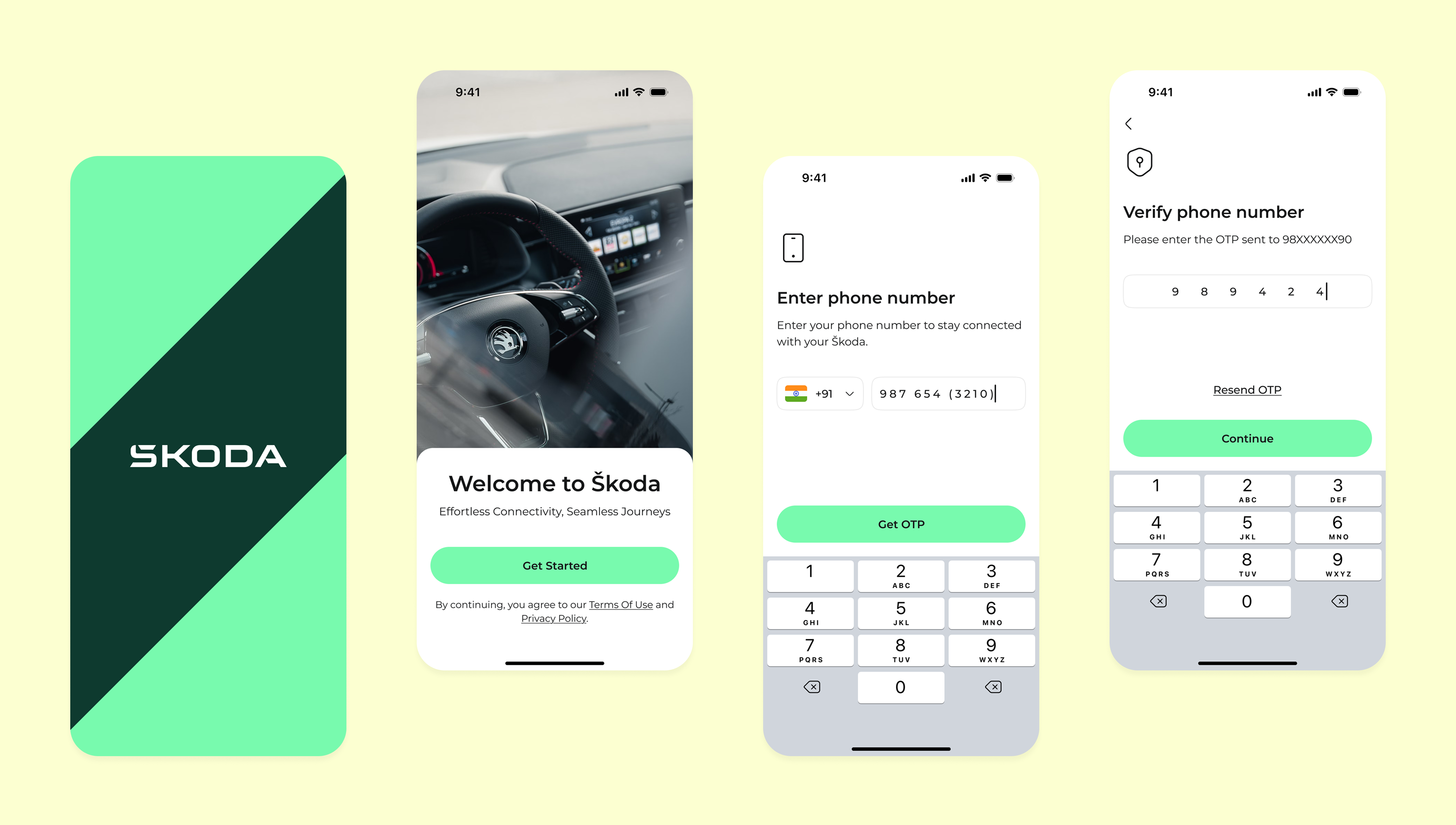
My initial idea was a standard email+password onboarding with OTP as a secondary verification. Midway through, I audited 6 competitor apps — every single one had a "forgot password" as the #2 action after login. Onboarding friction was the real problem. I reframed the entire flow around phone number + OTP. This became the most distinctive part of the concept.
This concept followed a compressed design sprint, moving from research to high-fidelity prototypes while staying anchored to user needs at every decision point.
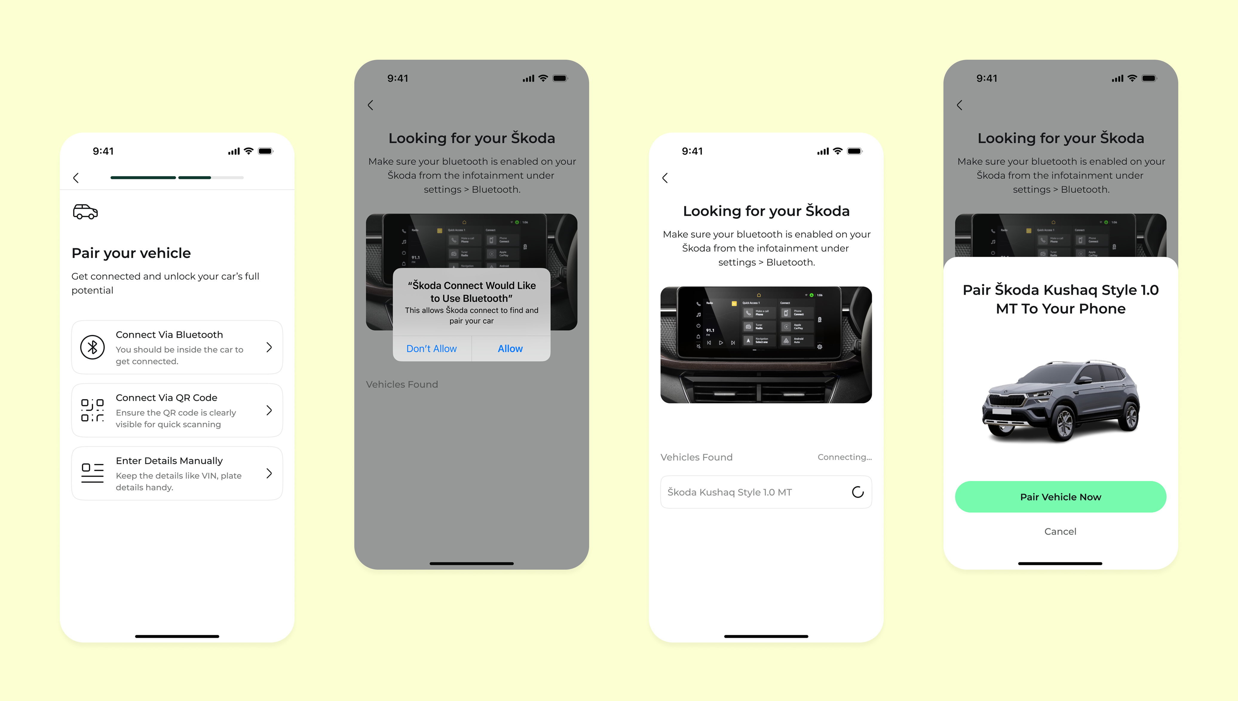
The onboarding flow is designed to feel effortless. No VIN numbers, no dealer codes. Just your phone number, a 6-digit OTP, and you're in, pairing your vehicle is the first thing you do inside the app, not a prerequisite to enter.
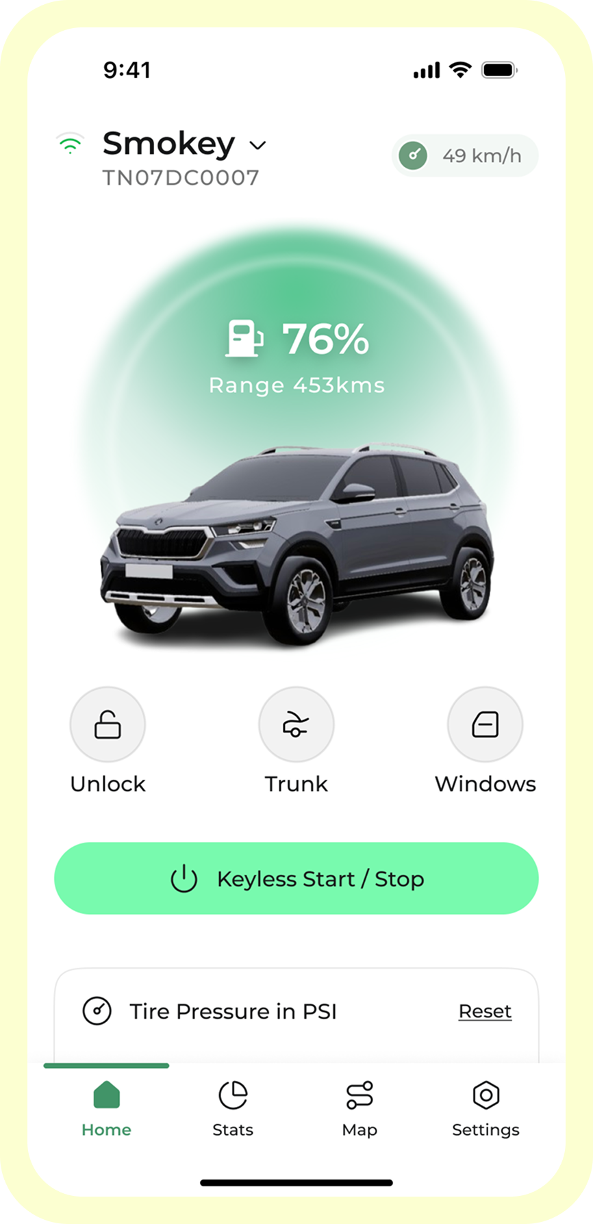
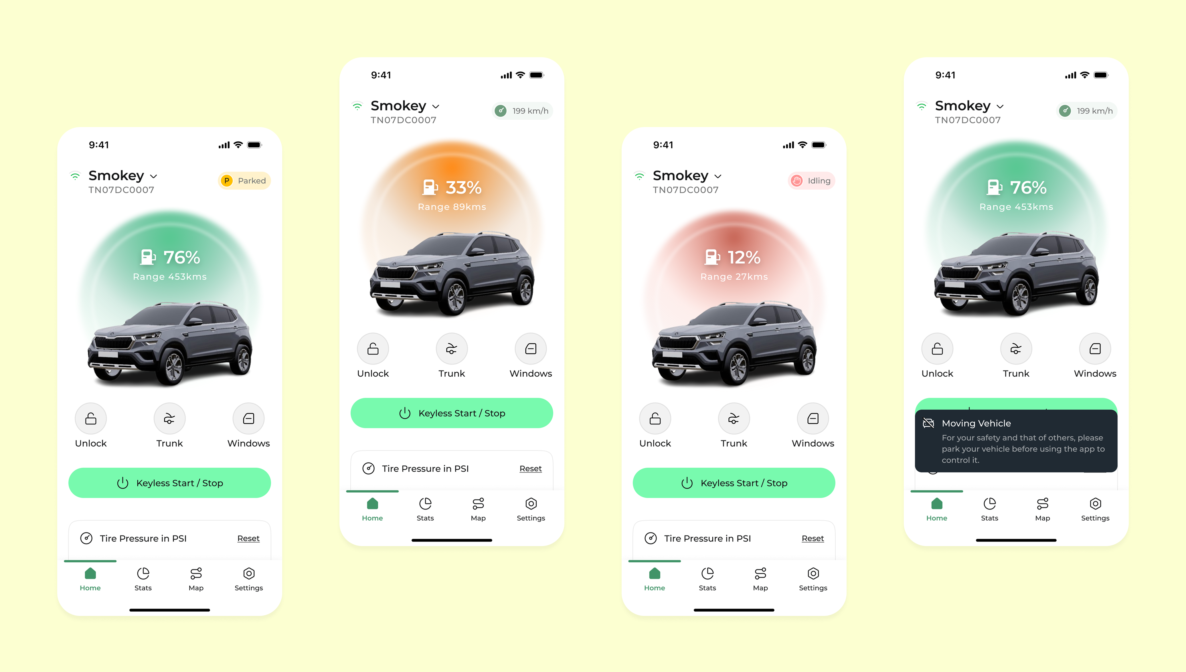
The home dashboard puts the car first. The header section shows the vehicle model, a real-time silhouette rendering, and the two stats that matter most, fuel percentage and estimated range. Below it, the 4 most-used actions are arranged in a 2×2 grid within thumb reach.
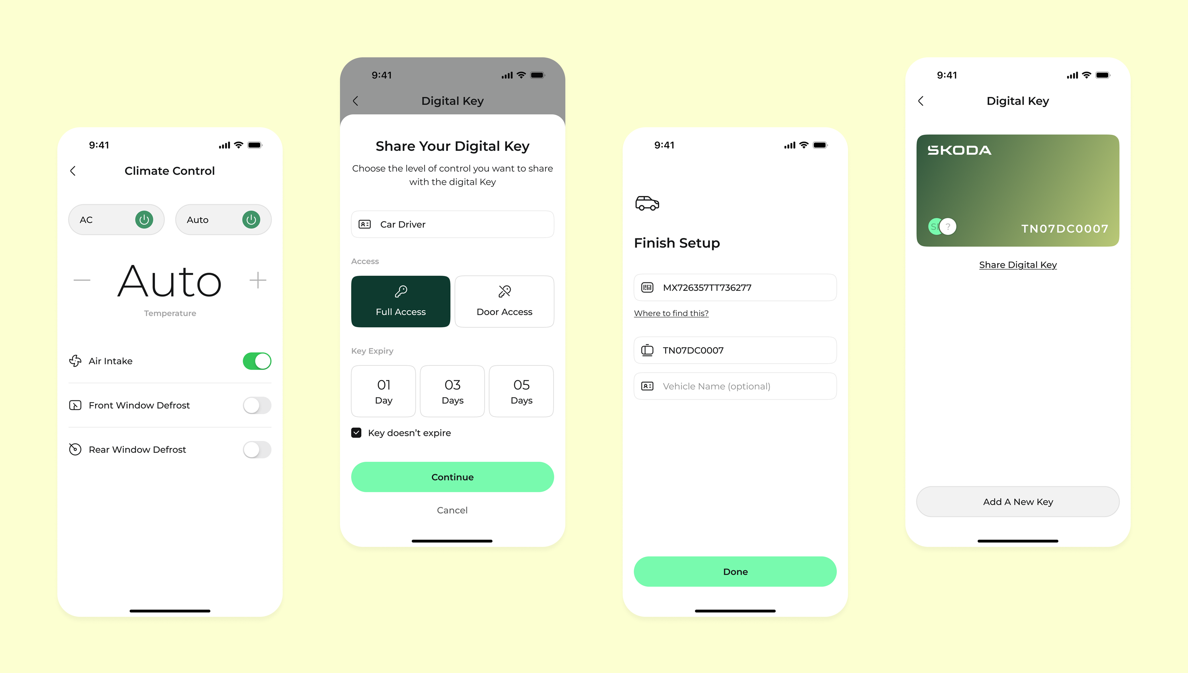
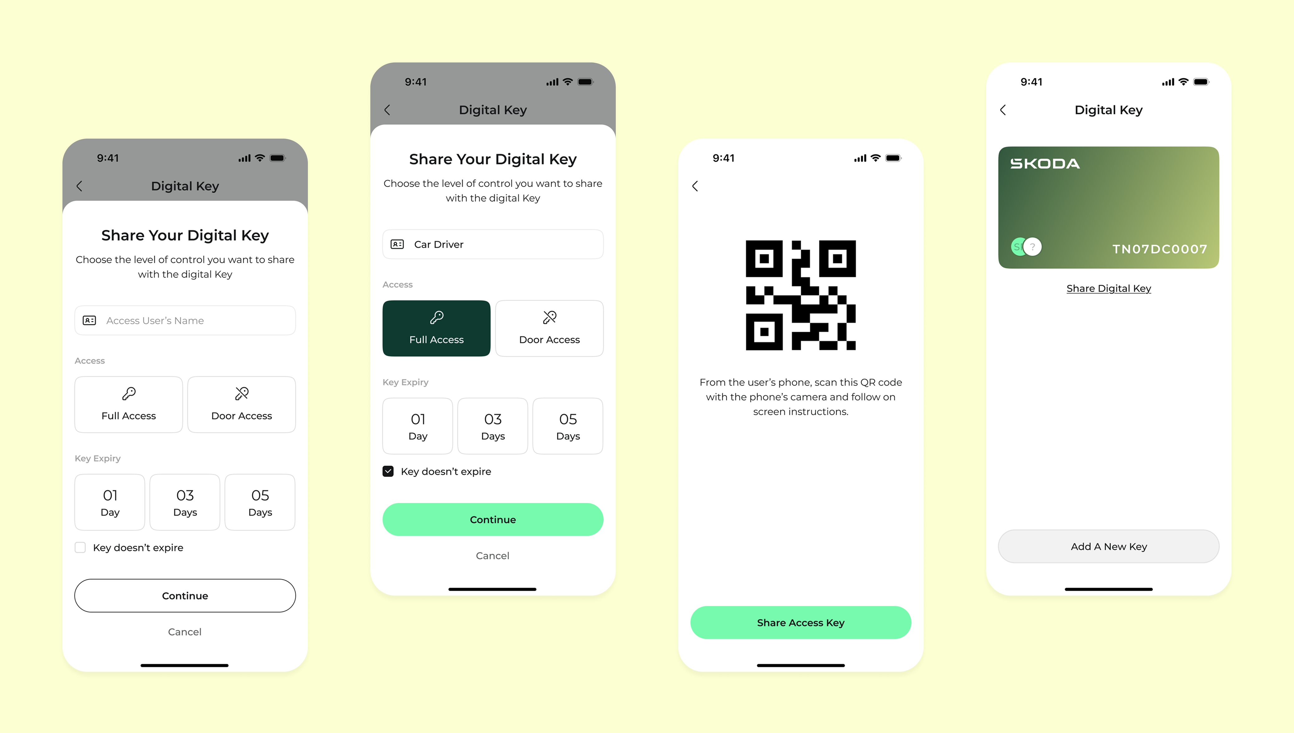
The digital key feature reimagines car sharing. Instead of handing over a physical key (or a clunky token), you share access directly from your phone with granular permission controls, time-limited, revocable, and no sign-up required for the recipient.
From pre-conditioning the cabin to checking tyre pressure before a long drive, each control screen is built for speed. Big tap targets, clear states (on/off/active), and haptic confirmation on every critical action.
Connected car apps aren't just a customer experience play, they're a retention and loyalty instrument. For an automotive brand, the app is the primary touchpoint between purchases. Here's the business case for investing in this direction:
OTP-first onboarding removes the most common reason for abandonment (forgotten password, VIN confusion). Target: <60s to first meaningful action. Metric: 7-day retention after install.
As Škoda's EV lineup expands, digital key sharing positions the app as infrastructure, not just a remote control. Partners, valets, charging station operators. This feature moves the app from utility to platform.
Every visual decision in this design system serves a function. The dark forest green creates premium contrast both indoors and in bright sunlight. Mint (#78faae) is reserved exclusively for active states and success feedback, a visual language that users learn quickly.
Traditional connected car apps require email, password, and sometimes dealer account verification before the user can even see the app. This creates a significant drop-off. OTP authentication using a phone number means zero memory load, you already know your phone number. The app sends a 4-digit code, you enter it, and you're in.
A fully dark interface creates legibility issues when switching between dark (inside a garage) and bright (direct sunlight) environments. The solution was a hybrid: the car and status area uses the dark forest green (which reads better in sunlight than black), while control panels and forms use white backgrounds for clarity and accessibility.
Colour in an automotive UI carries high stakes. Users need to instantly understand if their car is locked, if climate is running, or if a key share was successful. By using the mint green colour for active and success states only (and never for decorative purposes), I built a colour-to-meaning association that becomes second nature after just a few sessions.
The existing paradigm for sharing car access is binary, you either hand over the physical key (full access) or you don't share at all. This concept introduces permission-level sharing: the primary owner can independently toggle unlock/lock, engine start, climate, and location visibility for each shared key. Each share can also be time-limited.
Deciding what not to build is as important as what you ship. These were all scoped into v1, and all deliberately cut.
A full live map showing the car's real-time location was in v1 scope. It tested well in concept but created two hard problems: continuous GPS polling drains battery significantly, and it raised privacy concerns (who else can see this?). I replaced it with a discrete "last parked location" string, honest about what can reliably be shown without battery or privacy cost.
Fuel consumption graphs, trip logs, driving efficiency scores, all compelling features. But they require persistent data logging, which adds backend complexity and surfaces questions about data ownership that need product + legal alignment before design can proceed. This is a v2 strategic feature, not a v1 UX feature.
Remote music/podcast control from the phone sounded useful until I mapped the actual user journey: you control audio when you're in the car, not from outside it. The feature was solving a problem that didn't exist in practice. It would have added 3 screens and a new API dependency for zero observable user value.
Škoda's EV lineup is growing fast, charging station maps, charge scheduling, and battery preconditioning are all highly relevant. But designing them well requires EV-specific user research (range anxiety, charging behaviour) that would have doubled the project scope. I scoped the design system to make EV screens additive, not a redesign.
I jumped straight into wireframes before writing down what "done" actually looked like. Halfway through, I realised I was optimising for visual completeness rather than a clear user outcome. Next time: write a one-page brief, state the top 3 user jobs-to-be-done, and pin it to the top of the file before drawing a single frame.
Three informal reviewers pushed back on the 2-tap engine start, saying it felt slower. It is. But a connected car is not a social app. Accidental activation of a running engine is a real safety risk. I held the friction deliberately and documented exactly why. Comfortable UX and correct UX aren't always the same thing.
The home dashboard hierarchy, the 4-action grid, the OTP flow — these are my best design hypotheses, not proven patterns. I'd want to run 6–8 sessions with real Škoda owners before treating any of it as directionally correct. This concept earns the right to be tested, not shipped.
This concept is still fundamentally reactive — you open it to check on your car. The real opportunity is anticipatory design: the app surfaces "Your rear-right tyre pressure dropped 4psi overnight. You have a 280km drive on Friday, worth topping up." That's the version that earns genuine loyalty.
The complete Škoda Connected App — every flow, every screen, shipped.